Designing for social media is not just about looking good — it’s about driving action. Whether your goal is clicks, sign-ups, or sales, your creativity plays a huge role in conversion. This blog breaks down the key elements of a high-performing social media design that helps you stand out and sell.
1. Grab Attention in 3 Seconds
Your audience is scrolling at lightning speed — and you only have a moment to stop them. That’s why your creative needs a bold visual hook. Use striking colors, dramatic imagery, or motion effects like GIFs or reels. Pair it with strong, emotional words to make them pause and pay attention. The first impression decides whether they stay or scroll.
Bold headlines or power words
High-contrast visuals
Unique animations or motion effects
Pro Tip: Reels or GIF-style animations increase engagement by up to 35%.
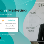
2. Make Your Goal Clear
Every creative should have a clear objective behind it — whether it’s generating website clicks, increasing sign-ups, or promoting a product. Don’t confuse your audience with cluttered visuals or mixed messages. Guide them with intentional design choices that highlight one key action. When your goal is clear, the results follow.
Want more traffic? Highlight your CTA.
Promoting a product? Feature the key benefit visually.
Launching something new? Use teaser visuals.
with your end action.Align every design element
3. Keep Text Minimal & Impactful
Less is more — especially on mobile screens. Avoid crowding your design with too much information. Use concise, benefit-focused headlines and short punchy lines. Make sure your text is readable even at a glance. Strategic use of whitespace and bold keywords will make your message pop without overwhelming.
Use headlines (5–7 words max)
Keep supporting text readable even on mobile
Use contrast to highlight offers or urgency
(e.g. “Ends Today”, “Flat 50%”)
4. Stay Consistent with Brand Identity
Consistency isn’t boring — it’s powerful. When your posts look and feel aligned, your audience starts recognizing your brand instantly. Use the same fonts, colors, and tone in all your creatives. Whether it’s minimal, quirky, or bold, maintaining that visual style across platforms builds trust and brand recall.
Stick to brand fonts, color palette, logo usage
Maintain a consistent layout grid or visual tone
Example: Bold + neon + glitch? Then stick to that vibe across posts.
5. Design for Platform-Specific Formats
Each platform has its own best practices for sizing, layout, and interaction. What works great on Instagram may not fit Facebook or look good on LinkedIn. Always adapt your design format — portrait for reels, square for feeds, minimal text for ads. Also test how it looks on mobile before going live.
Instagram feed: 1080×1350 px (portrait)
Stories/Reels: 1080×1920 px (keep safe zones in mind)
Facebook: Less than 20% text for ads
Preview your post on mobile before publishing!
6. Use Emotion & Visual Storytelling
People remember stories, not just products. Tell a quick transformation, show a relatable struggle, or highlight a real result. Use images and text that make people feel something — curiosity, trust, inspiration. Emotional connection builds engagement, and that leads to real action.
Before vs After visuals
Problem → Solution layouts
Testimonials or real results
Visual storytelling builds authenticity and trust.
7. Test What Works. Drop What Doesn’t.
Design is not “one and done.” Sometimes small changes — like color, placement, or copy — make a big difference. Run A/B tests with different creative variations. See what performs better and improves based on real data. Let your audience show you what they respond to — not assumptions.
Run A/B tests to see which:
Colors perform best
Layouts get more clicks
Refine your creative strategy based on real feedback.